Composition is the soul of photography, but not an easy subject to master, and not one that can be learned by following simple rules. The first thing inevitably taught in photographic composition is “The Rule of Thirds.” It’s easy to teach, and you can’t talk about composition without including it, but it is problematic. The way this concept is currently taught is misleading, and slavishly following this “Rule” can slow down a person’s advancement as a photographer. It can also keep people from exploring composition more in depth.
When you read about the ROT (Rule of Thirds), it is usually presented like this, “Amateurs tend to place their subjects in the middle of the frame. To create more interesting and balanced compositions, imagine your frame being divided in thirds horizontally and vertically, like a Tic-Tac-Toe board. Place your subject or point of interest on one of the four intersecting points.” It certainly makes composition look easy, but if it is wrong to put your subject in the center, then why is it ok to limit it to just four points?
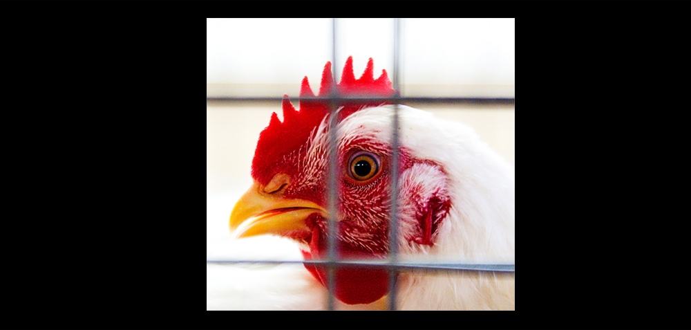 It is not a rule.
Rules are things that you should “Always” or “Never” do. The ROT is never taught as just a concept, guideline or an idea. It is presented as a “rule,” and you are never taught when NOT to use it, and there are plenty of times when you shouldn’t. It is really a concept masquerading as a rule, and the people least likely to know this are the exact ones being taught it; beginners. There are those that will say, “Well you have to learn the rules so you can break them.” An artist should be looking for thoughts that guide their work, not rules they can either follow or break. Consider any “rule” you learn to be an assumption, something to be tested and challenged. It is up to you to decide what your rules are.
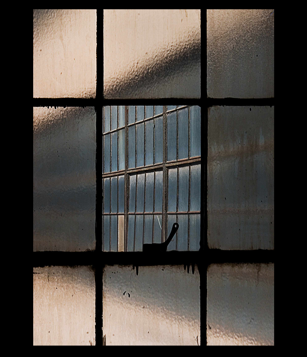 The entire frame is yours.
The idea that the center of the frame is for amateurs, and the intersection points are where the pros place their subjects, is insulting. You are an artist, you own the entire frame, it is all yours, use it as you please. Put something in the dead center if you like, or shove it way up in the corner if you think that is best for the shot. Create how you choose. The entire frame is your responsibility, it is what you control, what you play with, no thought or person has any claim to it (unless they are paying you).
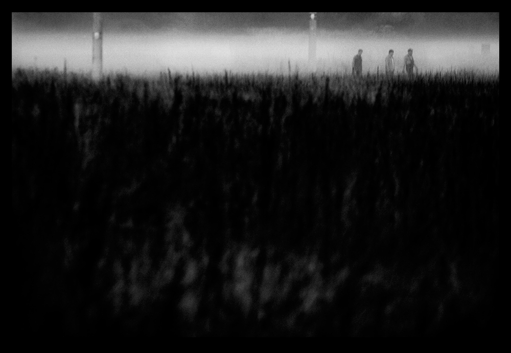 Limit your limits.
The thoughts in your head can either limit your creativity or expand it. The ROT is very limiting, and that is dangerous.
Composition is the art of arranging things in a photograph so the image has the greatest impact. A photograph is a puzzle that you need to solve. How much should you believe in a solution that is ignorant of what the puzzle is? There are plenty of things that you should be able to do without conscious thought, like using your camera. Master the things you can, so when you are shooting you can focus on the other decisions to be made. At some point you will be composing by feel. You won’t be consciously thinking about where to place things. The better you can understand the forces at play in composition at the start, the better your intuition will be in the future.
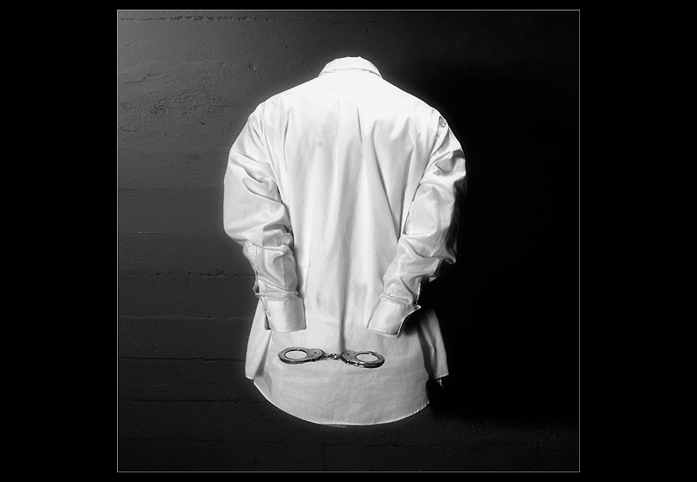 You are never taught when not to use it.
The best explanation as to when not to us the ROT is in the excellent book. “Universal Principles of Design” where they state you should not use the ROT when you have a “strong primary element that is reinforced by the surrounding space.” If your subject is visually compelling enough, that placing it to one side would cause the photo to appear off balance then you should center it.
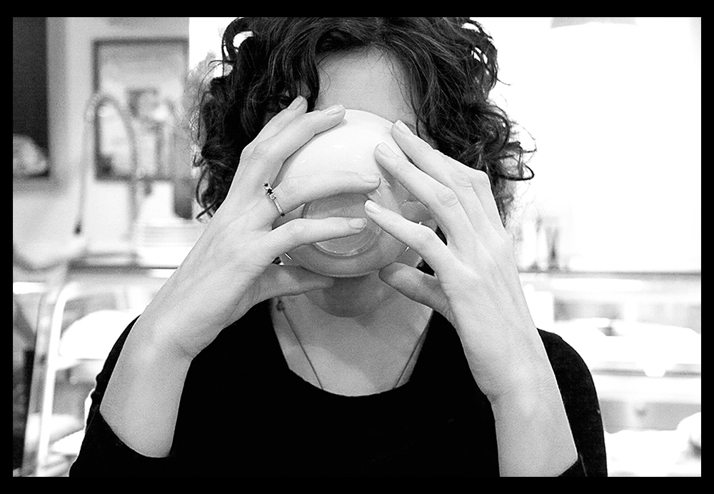 It never takes in to account where the photo is being used.
What if you are shooting a magazine cover, should you really put your model off to the side? Go to any magazine rack, how many photos are shot with the subject in the center? What if the photo is going to be used with other photos? The ROT doesn’t take into account what that photo needs to do and where it is being placed. That is understandable since it was first applied to painting, and applied to the relationship of elements in landscape painting. The concept being you shouldn’t paint a landscape with half earth and half sky in it, but rather use a relationship of one third and two thirds. Landscape paintings are stand alone objects, and consideration for how and where they will be used is not as common as with photographs.
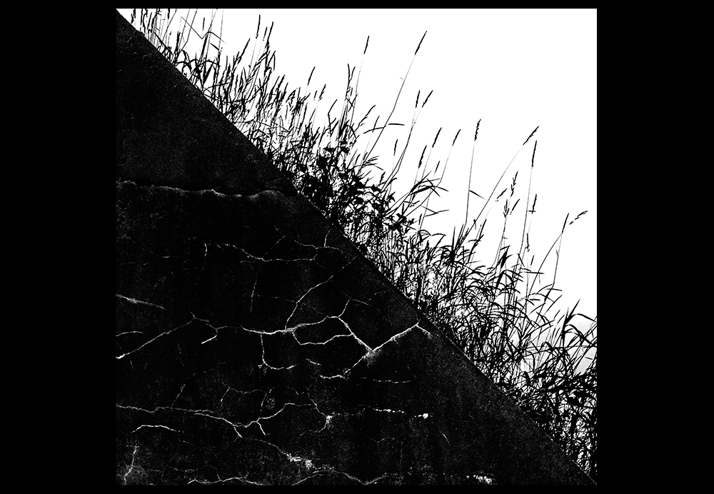 It doesn’t take into account the subject.
What if you have to take a photo of a child reaching up to the viewer asking for help? Or a shot from an employee’s perspective of a yelling boss? What about the view of a driver about to hit a deer in the road? Sure you could put the subjects off to the side, but don’t certain subjects beg to be put front and center? Human interaction normally happens right in front off us, to replicate that experience you want to center your subject. When someone yells at you do they stand off to the side for greater impact, or do they stand right in front of you and get in your face? There are plenty of subjects that deserve to be placed dead center and “in your face.”
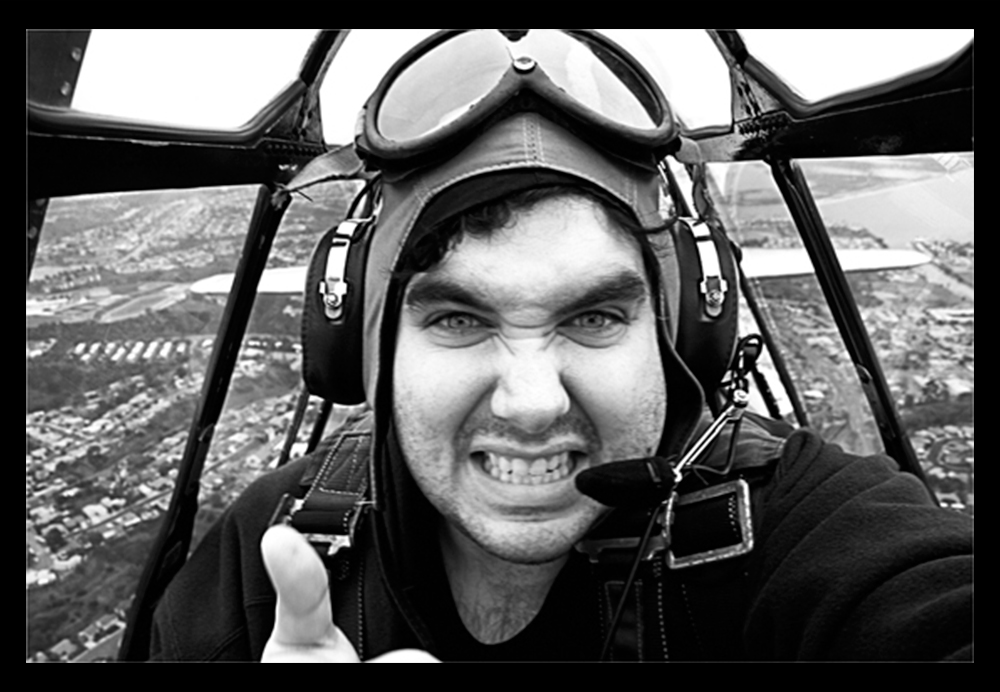 The idea that amateurs place things in the center is a myth.
Let’s assume this was actually true for a minute, what advice do you think is the one piece of advice that all amateurs get on composition? So even if it was a real problem, it would be quickly solved. The center placement myth might have applied in the 40’s and 50’s when many people shot with square format cameras. There is something about the square format that lends itself to placing things in the center. Also with many twin lens camerasyou were looking down at the viewfinder, and your image was reversed. Composing with a reversed image is a little tricky, so getting something centered was a good thing. But with the popularity of SLRs and the 35mm format, these constraints disappeared. I can not say for certain whether this really gave rise to the popularity of the ROT, it probably didn’t, but I don’t mind fighting a little myth with conjecture.
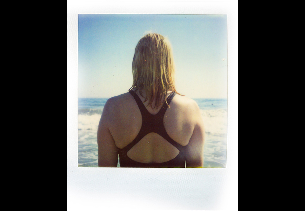 All “Interest” points are not created equal.
The ROT is taught as if all the intersecting or “Strong” points are equal. They are not. Our eyes have a left to right bias when looking at photographs. Most of the science behind eye movement attributes this to reading from left to right. Every time we read, we reinforce that bias. Evidence suggests we even have a preference for how subjects appear to “move” in photographs, preferring subjects that move from left to right. This bias is the opposite with cultures that read right to left.
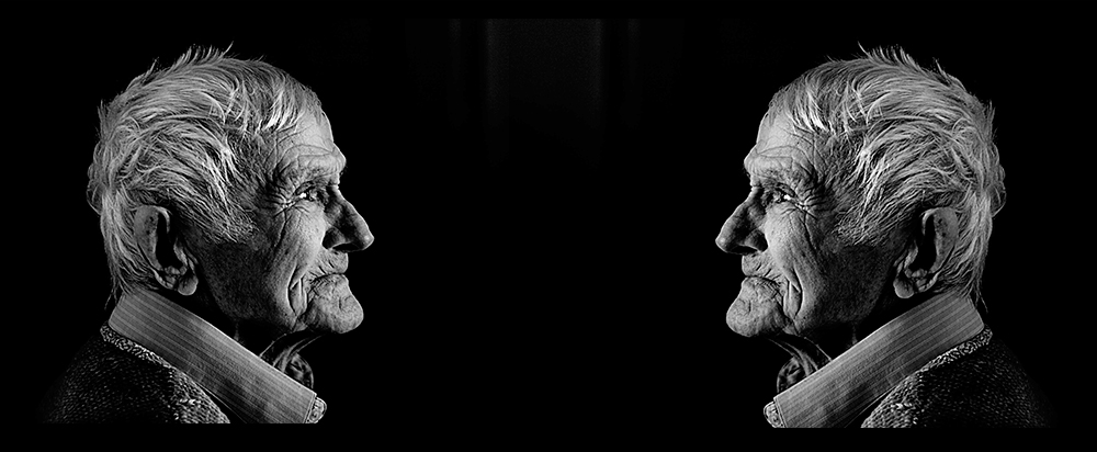
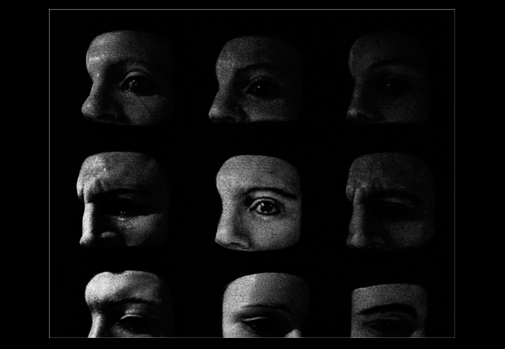 The left to right bias changes the power of the intersecting points. Take a photo where the subject is placed off to the right of the frame, and then take the same image and flip it so the subject is on the left. Do the images feel the same? If there were no bias than both images should feel exactly the same. But by flipping an image you change what the eye sees first, and how it moves around the photo. Potentially it means that the right two points on the ROT grid are stronger than the left, but it really depends on the photo. If placing a person on the right hand side of the image means they are looking “outside” of the frame, you have a much different effect than placing them on the left looking into the center of the frame. If you are photographing something in motion then you my find that placing the subject on the left hand side of the frame, and leaving the right hand side open for the subject to seemingly move in to, may make for a better picture. The bottom line is you should be thinking when you shoot, and not rely on rules that are ignorant of the situation.
 Complaining about a problem without proposing a solution is called whining - (Sometimes attributed to Teddy Roosevelt)
Should you use the Rule of Thirds? That is up to you. I am not saying you shouldn’t place subjects on those points, that is as bad as saying “Don’t place your subject in the center.” Where you put things is your business, and I wouldn’t try to limit your options with arbitrary “rules.” The central tenet of the Bauhaus school of Art and Architecture was that, “Form follows function.” Translated for photographers, “Let your subject or purpose of the photograph inspire the composition.” If placing your subject on one of those four points works for the shot, go for it. It is your frame, it doesn’t belong to anybody else.
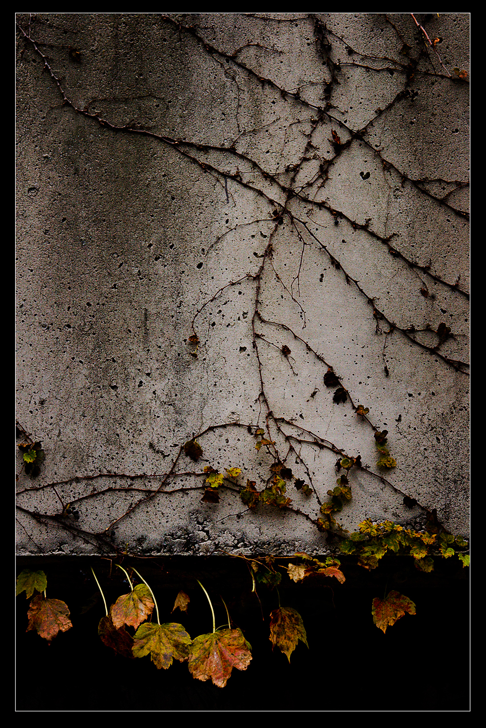 How you compose is part of your photographic fingerprint, it is one of the fundamental ways that your work is unique. The way the ROT is taught today is without nuance, subtlety or any guidance as to when not to use it. The beginning photographer, not knowing much, is the least likely person to question this “rule.” The danger is that it will slow down (or end) their exploration of composition. As with anything, you stop asking questions when you “know” the answer, you stop exploring when you have mapped out the territory. Artistic composition is an endlessly fascinating subject, and you can spend a lifetime studying it, but not if you think there are only four points of interest.
(If you would like to dig deeper, and learn more about where the ROT came from, check out the Golden Ratio, the golden Spiral, and the Fibonacci Spiral, these are mathematical and aesthetic concepts. Also check out the Phi Grid which is similar to the ROT but based directly on the Golden Spiral.)
All images © Thann Clark
 It is not a rule.
Rules are things that you should “Always” or “Never” do. The ROT is never taught as just a concept, guideline or an idea. It is presented as a “rule,” and you are never taught when NOT to use it, and there are plenty of times when you shouldn’t. It is really a concept masquerading as a rule, and the people least likely to know this are the exact ones being taught it; beginners. There are those that will say, “Well you have to learn the rules so you can break them.” An artist should be looking for thoughts that guide their work, not rules they can either follow or break. Consider any “rule” you learn to be an assumption, something to be tested and challenged. It is up to you to decide what your rules are.
 The entire frame is yours.
The idea that the center of the frame is for amateurs, and the intersection points are where the pros place their subjects, is insulting. You are an artist, you own the entire frame, it is all yours, use it as you please. Put something in the dead center if you like, or shove it way up in the corner if you think that is best for the shot. Create how you choose. The entire frame is your responsibility, it is what you control, what you play with, no thought or person has any claim to it (unless they are paying you).
 Limit your limits.
The thoughts in your head can either limit your creativity or expand it. The ROT is very limiting, and that is dangerous.
Composition is the art of arranging things in a photograph so the image has the greatest impact. A photograph is a puzzle that you need to solve. How much should you believe in a solution that is ignorant of what the puzzle is? There are plenty of things that you should be able to do without conscious thought, like using your camera. Master the things you can, so when you are shooting you can focus on the other decisions to be made. At some point you will be composing by feel. You won’t be consciously thinking about where to place things. The better you can understand the forces at play in composition at the start, the better your intuition will be in the future.
 You are never taught when not to use it.
The best explanation as to when not to us the ROT is in the excellent book. “Universal Principles of Design” where they state you should not use the ROT when you have a “strong primary element that is reinforced by the surrounding space.” If your subject is visually compelling enough, that placing it to one side would cause the photo to appear off balance then you should center it.
 It never takes in to account where the photo is being used.
What if you are shooting a magazine cover, should you really put your model off to the side? Go to any magazine rack, how many photos are shot with the subject in the center? What if the photo is going to be used with other photos? The ROT doesn’t take into account what that photo needs to do and where it is being placed. That is understandable since it was first applied to painting, and applied to the relationship of elements in landscape painting. The concept being you shouldn’t paint a landscape with half earth and half sky in it, but rather use a relationship of one third and two thirds. Landscape paintings are stand alone objects, and consideration for how and where they will be used is not as common as with photographs.
 It doesn’t take into account the subject.
What if you have to take a photo of a child reaching up to the viewer asking for help? Or a shot from an employee’s perspective of a yelling boss? What about the view of a driver about to hit a deer in the road? Sure you could put the subjects off to the side, but don’t certain subjects beg to be put front and center? Human interaction normally happens right in front off us, to replicate that experience you want to center your subject. When someone yells at you do they stand off to the side for greater impact, or do they stand right in front of you and get in your face? There are plenty of subjects that deserve to be placed dead center and “in your face.”
 The idea that amateurs place things in the center is a myth.
Let’s assume this was actually true for a minute, what advice do you think is the one piece of advice that all amateurs get on composition? So even if it was a real problem, it would be quickly solved. The center placement myth might have applied in the 40’s and 50’s when many people shot with square format cameras. There is something about the square format that lends itself to placing things in the center. Also with many twin lens camerasyou were looking down at the viewfinder, and your image was reversed. Composing with a reversed image is a little tricky, so getting something centered was a good thing. But with the popularity of SLRs and the 35mm format, these constraints disappeared. I can not say for certain whether this really gave rise to the popularity of the ROT, it probably didn’t, but I don’t mind fighting a little myth with conjecture.
 All “Interest” points are not created equal.
The ROT is taught as if all the intersecting or “Strong” points are equal. They are not. Our eyes have a left to right bias when looking at photographs. Most of the science behind eye movement attributes this to reading from left to right. Every time we read, we reinforce that bias. Evidence suggests we even have a preference for how subjects appear to “move” in photographs, preferring subjects that move from left to right. This bias is the opposite with cultures that read right to left.
 The left to right bias changes the power of the intersecting points. Take a photo where the subject is placed off to the right of the frame, and then take the same image and flip it so the subject is on the left. Do the images feel the same? If there were no bias than both images should feel exactly the same. But by flipping an image you change what the eye sees first, and how it moves around the photo. Potentially it means that the right two points on the ROT grid are stronger than the left, but it really depends on the photo. If placing a person on the right hand side of the image means they are looking “outside” of the frame, you have a much different effect than placing them on the left looking into the center of the frame. If you are photographing something in motion then you my find that placing the subject on the left hand side of the frame, and leaving the right hand side open for the subject to seemingly move in to, may make for a better picture. The bottom line is you should be thinking when you shoot, and not rely on rules that are ignorant of the situation.
 Complaining about a problem without proposing a solution is called whining - (Sometimes attributed to Teddy Roosevelt)
Should you use the Rule of Thirds? That is up to you. I am not saying you shouldn’t place subjects on those points, that is as bad as saying “Don’t place your subject in the center.” Where you put things is your business, and I wouldn’t try to limit your options with arbitrary “rules.” The central tenet of the Bauhaus school of Art and Architecture was that, “Form follows function.” Translated for photographers, “Let your subject or purpose of the photograph inspire the composition.” If placing your subject on one of those four points works for the shot, go for it. It is your frame, it doesn’t belong to anybody else.
 How you compose is part of your photographic fingerprint, it is one of the fundamental ways that your work is unique. The way the ROT is taught today is without nuance, subtlety or any guidance as to when not to use it. The beginning photographer, not knowing much, is the least likely person to question this “rule.” The danger is that it will slow down (or end) their exploration of composition. As with anything, you stop asking questions when you “know” the answer, you stop exploring when you have mapped out the territory. Artistic composition is an endlessly fascinating subject, and you can spend a lifetime studying it, but not if you think there are only four points of interest.
(If you would like to dig deeper, and learn more about where the ROT came from, check out the Golden Ratio, the golden Spiral, and the Fibonacci Spiral, these are mathematical and aesthetic concepts. Also check out the Phi Grid which is similar to the ROT but based directly on the Golden Spiral.)
All images © Thann Clark


